Heads up! this post was created when Microthemer was at version 2. The current version is 7.
Some references to the interface may be out of date.
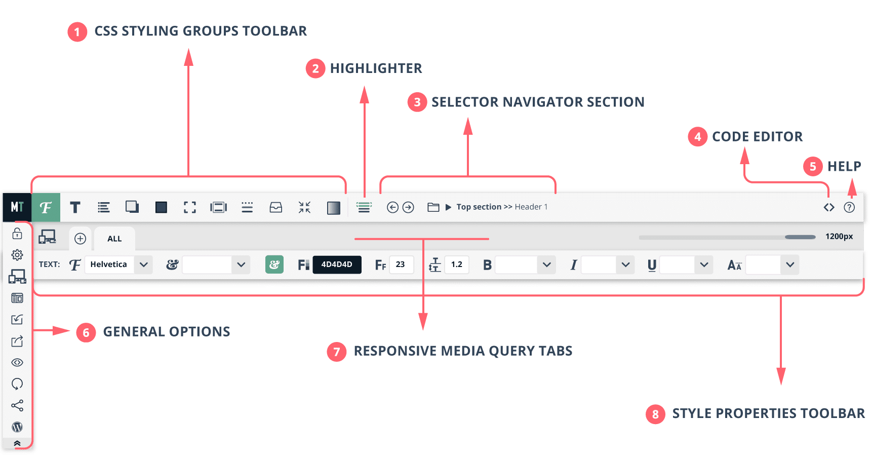
The Microthemer interface sits on top of your website so that you can see your style changes as they happen. All tools and options are organised into 8 sections.
CSS styling groups: Microthemer groups over 80 CSS styling options into 11 categories: font, text, list, shadow, background, dimensions, margins & padding, behaviour, border, position, and gradient. It’s easy to navigate between the groups by simply clicking on an option group icon.
Highlighter: highlights the element (or multiple elements) that the current “selector” targets on your web page. A selector is simply a way of targeting different things on your page e.g. an image, or several images, a single heading 1, or all headings on your site. You need to target a page element with a selector before you can restyle it.
Selector navigator section: forward/backward navigation arrows enable you to quickly jump between adjacent selectors. A main menu allows for more advanced navigation between selectors in different folders. The selector navigation section doubles up as a “selector and folder management” section. You can create, delete, rename, copy, move and re-order folders and selectors from here.
Code editor: easily switch into custom CSS code editing using the ACE code editor with syntax highlighting. You can also target specific versions of Internet Explorer by applying CSS that will be included in stylesheets that load with conditional comments.
Help section: load these online docs from a popup window without having to leave the Microthemer interface.
General options: unlock Microthemer, manage your global preferences, set your own responsive media queries, define the preview screen width (useful for “mobile first” design) , restore your settings from a previous save point, view the CSS code Microthemer generates, manage installable design packs, or navigate back to the main WordPress dashboard.
Responsive media query tabs: define styles that will only take effect on specific screen widths (e.g. less than 480px, or more than 760px). The slider can be used to preview how your site will look like at different screen widths. When you switch between tabs, the screen width adjusts automatically and the min/max values on the slider are constrained to reflect the current media query.
Style properties toolbar: displays individual CSS style properties for each of the 11 styling groups (e.g. font-family, color, and font-size on the “font” option group). Microthemer reports the existing computed CSS style of the element (or elements) that your selector targets over the top of the style editing options (on empty fields or “on hover” as a tooltip). This way you can inspect and edit CSS styles in one place.
Toolbars Overview
Heads up! this post was created when Microthemer was at version 2. The current version is 7. Some references to the interface may be out of date.
The Microthemer interface sits on top of your website so that you can see your style changes as they happen. All tools and options are organised into 8 sections.