- This topic has 3 replies, 2 voices, and was last updated 7 years, 11 months ago by
Sebastian.
| Author | Posts |
|---|---|
|
tech500
May 31, 2018 at 5:50 am
|
Heads up! this post was created when Microthemer was at version 5. The current version is 7. Some references to the interface may be out of date. Hello, I want the word “bloomingdales” to stay as one word without having the letters break into a new line on a smaller browser screen. Thanks |
|
Sebastian
May 31, 2018 at 9:21 am
|
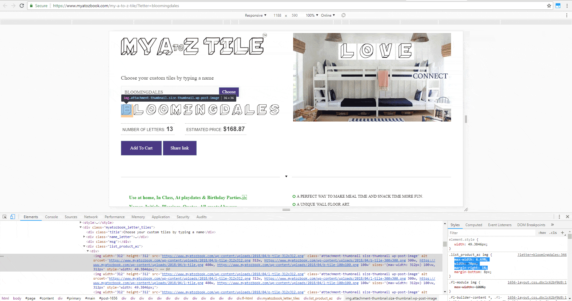
Hey Dan, In short, you need to create a selector for the images e.g.
And then set max-width to 6.69% and margin-right to 1%. Or some variation of those numbers, adding up to 7.69% in total. I simulated these styles using Chrome’s dev tools:
I arrived at those percentage style values by doing some maths. The word Bloomingdales is made up of 13 images, one for each letter.
You initially had a right margin on the letters of 8px. The CSS calc function makes it possible to mix percentages and fixed pixels these days. But to make things simple, I’ve suggested setting the right margin as a percentage too (1%).
So now, the total width + margin of all 13 letters will not exceed 100% – the width of the container element. Does that make sense? Thanks, |
|
tech500
May 31, 2018 at 10:03 am
|
Hi Sebastian, I’ll try that, but that is based on calculating the current number of letters. Thanks |
|
Sebastian
May 31, 2018 at 1:13 pm
|
Hey Dan, You make a good point, I wasn’t considering the dynamic nature of your UI. On closer inspection, I see why inline width styles have been added to the images with JavaScript – I guess by the plugin/script you’re using for the letters. The inline width value should be calculated so that the letters do not spill over multiple lines. However, it seems this isn’t always working. And this might be because the script isn’t accounting for the 8px right margin when doing the maths. A workaround for this could be to setting margin-right to 0. And then add some spacing between the letters by adding padding-right:1%. Because the images have box-sizing set to border-box, the padding will form part of the width, rather than being added to it (like with margin). As a final note, I notice that the inline width is calculated when the page first loads, and is not recalculated when the width of the screen changes. So you will need to refresh the page at a given screen width in order to preview how it will look to regular site visitors, as opposed to web designers that resize the browser 🙂 Cheers, |
