- This topic has 8 replies, 2 voices, and was last updated 7 years, 1 month ago by
Sebastian.
| Author | Posts |
|---|---|
|
Petran
February 27, 2019 at 3:53 pm
|
Heads up! this post was created when Microthemer was at version 5. The current version is 7. Some references to the interface may be out of date. Hello, I made my media Query for a Samsung phone (360px). Perhaps i did this wrong somewhere, but I can’t find out what. Regards, |
|
Sebastian
February 28, 2019 at 9:36 am
|
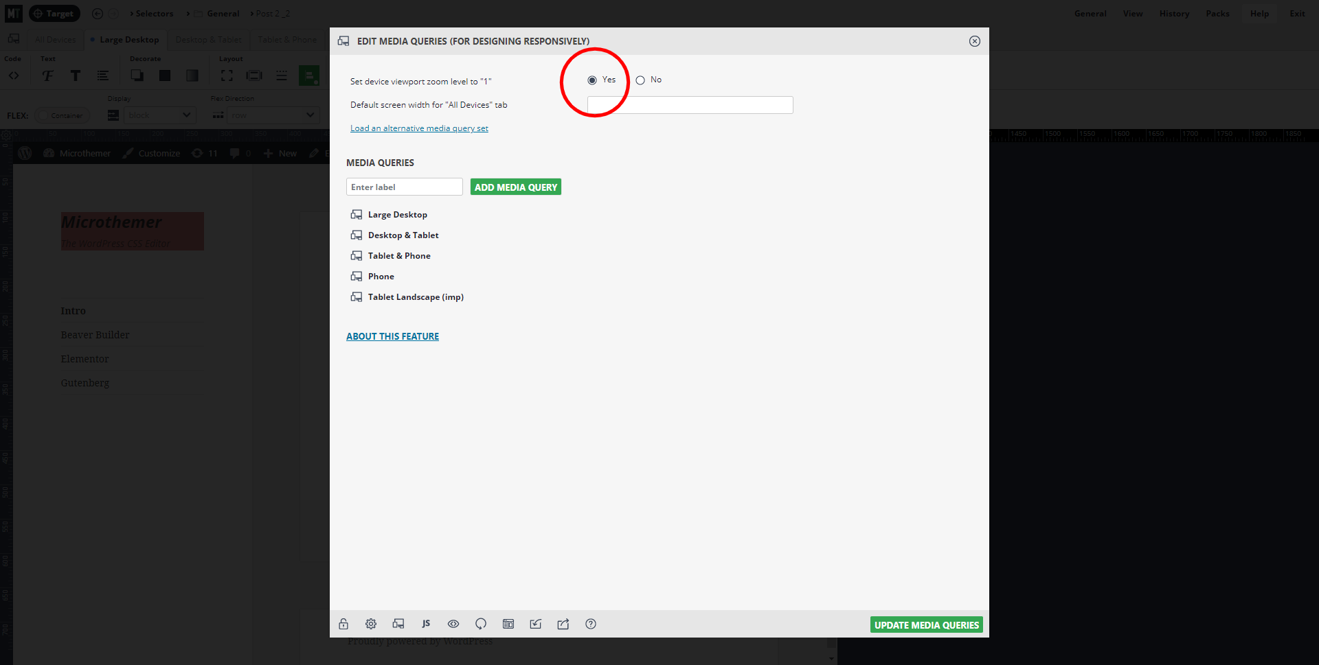
Hey Petran, Would you mind sending me a link to the page you’re working on? You can use our contact form to send privately if you prefer? When an actual mobile phone displays things differently to the mobile preview in Microthemer it can sometimes because the viewport zoom level needs to be set to 1 via General > Media queries:
From what you describe, I don’t think this is likely to be the issue, but worth mentioning just in case. I should know more once I’ve taken a look at your site. Cheers, |
|
Petran
February 28, 2019 at 12:49 pm
|
Hello Sebatian, Changing the viewport zoom did not affect the view. This screenshots can clarify my problem: The view of my Samsung S6 is equal to screen 2 (Firefox) Regards, |
|
Sebastian
February 28, 2019 at 6:26 pm
|
Hey, Thanks for sharing the screenshots Petran. I wonder if Microthemer is actually displaying the preview at 361px instead of 360px. It might seem counter intuitive that the text would wrap over two lines if the screen size it bigger, but I can see a style rule that kicks in at the 360 mark to reduce the font-size. This doesn’t apply at the 361px mark, so the font-size is too big to fit on a single line at that screen size. It might be a browser-specific issue that needs a fix. To figure out why Microthemer might be displaying the preview one pixel off I would need to access your site and inspect the interface. If you don’t mind providing me with access, please send credentials via our secure contact form. You can use this handy plugin to temporarily share access without creating a new account: https://en-gb.wordpress.org/plugins/temporary-login-without-password/ Cheers, |
|
Sebastian
March 1, 2019 at 12:59 pm
|
Hey Petran, Thanks for providing access. I just checked using Firefox and Chrome on my windows laptop. The text covers just one line in both browsers. What browser and operating system are you using? I did notice that the text displays slightly bigger in Firefox than it does in Chrome. And so I wonder if differences in text rendering between browsers / operating systems might be the cause of your issue, rather than MT’s preview width being out. If the text displays a notch bigger that what I see in Firefox at your end, that could explain why the text spans two lines. Cheers, |
|
Petran
March 1, 2019 at 1:22 pm
|
Hello Sebastian, I’m using Firefox on Ubuntu. Is there a solution for this besides getting away from Firefox? Regards, |
|
Sebastian
March 2, 2019 at 9:27 am
|
Hey Petran, I can’t think of anything Microthemer can do to mitigate the variable text rendering between browsers. When I inspect the computed font-size in Firefox at 360px screen width it say 42px – just like the other browsers. So it’s a bit of a quirk. You could set the font-size to 40/41px on the 360px tab as one way to deal this issue without changing your browser. Cheers, |
|
Petran
March 4, 2019 at 9:17 am
|
Hello Sebastian, Thanks for your support. Regards, |
|
Sebastian
March 4, 2019 at 10:48 am
|
You’re welcome Petran 🙂 |


