Tagged: responsive images, scaling
- This topic has 13 replies, 2 voices, and was last updated 8 years, 11 months ago by
 Sebastian.
| Author | Posts |
|---|---|
 htcmaarten
April 5, 2017 at 11:08 am
|
Heads up! this post was created when Microthemer was at version 4. The current version is 7. Some references to the interface may be out of date. Hi, I currently am struggling with making an image responsive. |
 Sebastian
April 6, 2017 at 10:49 am
|
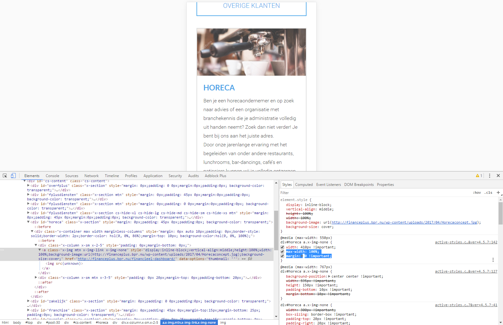
Hi there, You need to make two CSS adjustments in Microthemer to solve your issue.
When you’re working responsively, it’s a good idea to specify dimensions in % rather than pixels much of the time, although not necessarily exclusively. Fluid layouts (that use percentage widths) used in combination with a sprinkling of media queries produce the most flexible layouts that are easier to maintain. I talk about this more in our responsive tutorial. Here’s a screenshot of how I prototyped which styles would solve your issue via Chrome’s inspector. Notice the max-width/margin styles highlighted in blue:
I hope that helps. Please let me know if you require further assistance. Cheers, |
|
htcmaarten
April 11, 2017 at 10:11 am
|
Ok, thanks. That ‘almost’ seems to do the job, as I really want the margin (white around the pciture). So is there a way to set the ‘width’ to 100% MINUS 20px margin?… |
|
htcmaarten
April 11, 2017 at 11:10 am
|
Already a second question : the team members are displayed at the page: http://financeplus.bpr.nu/het-team-van-finance-plus/ |
|
Sebastian
April 15, 2017 at 4:50 pm
|
Hey, Sorry about the slow reply. In answer to your first question, you need to set padding rather than margin. Padding is the space between an element’s border and the content inside. Whereas margin is space outside the border. And so it is added to a width of 100%. Incidentally, so too is padding and border if the box-sizing property is set to ‘content-box‘ (the default). But on your site, the box-sizing property is set to ‘border-box‘, which means padding and border are included in the specified width. I explain this issue further in our CSS/Responsive tutorial: https://themeover.com/prepare-fluid-layout/ Are you still having problems with your second question? I see that the height of the boxes vary uniformly, rather than due to the length of text lines. And it seems like it might be a feature of the theme. Something controlled by JavaScript perhaps, which would make it tricky to override with CSS/Microthemer. Cheers, |
|
htcmaarten
April 17, 2017 at 9:21 am
|
I’ll dive into problem 1, |
|
htcmaarten
April 18, 2017 at 8:05 am
|
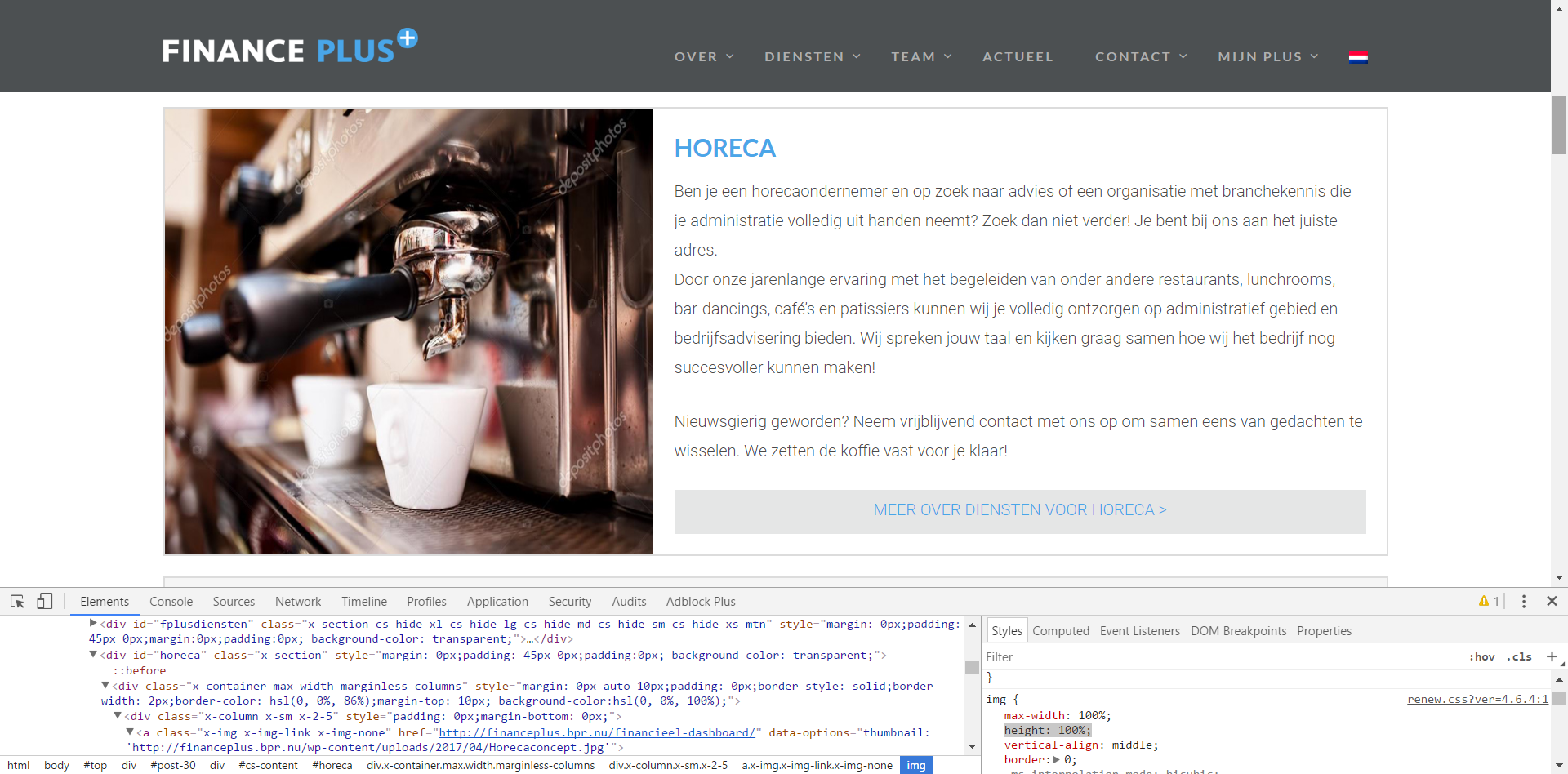
And about 1: But nothing changed. Then I deleted the other CSS and Style adjustments I made in the theme. This works for a big part; I just can’t get the box the full height of the column (only way is to set position to ‘Absolute’) and have the image fill the whole box. I think the theme did this trick with (display:inline-block;) but when I add this manually it doesn’t work. can you please look into it? It’s the first image in the box ‘HORECA’ on the homepage (http://financeplus.bpr.nu). It’s really a hassle for me to get this working. |
|
Sebastian
April 20, 2017 at 10:29 am
|
Again, sorry for the slow reply. I was away with in-laws in Poland over Easter and couldn’t get in much computer time. I’m back to normal work now though. So with issue number 1, aligning the image with the height of the text, is this what you want?
I noticed that you had targeted the link (a) element that contains the image . You had applied height/min-height 100% to the link element. But the image still had a height: auto rule from the theme. And so wasn’t filling the full vertical space. So you need to target the child image element rather than the link and set height:100% on the image. This should be possible by double-clicking the center of the image. If MT picks up the link again please let me know. You might also like to try out our 5.0 beta which makes targeting elements easier with hover/click. With issue number 2, it’s quite hard for me to figure out how to target the right div elements using only Chrome’s CSS prototyping tools. Would you mind sending me login details to your site via this secure contact form? Many thanks, P.S if you want the image totally flush with the text you could remove your Microthemer padding/border styles e.g.
|
|
htcmaarten
April 20, 2017 at 12:33 pm
|
Thanks! We’re ALMOST there ;)… |
|
Sebastian
April 20, 2017 at 1:31 pm
|
Great. You have a responsive style on the following selector setting the height to 25%: Content >> image100 You can set height to auto instead. And you will also want to remove the height: 120px you set on: Content >> testimage (so that the content flows after the image) Cheers, |
|
htcmaarten
April 20, 2017 at 2:29 pm
|
aaaarghhhh! Now, suddenly all my selectors -except for image100 – are gone. That is, i see the (+) mark, but not a name anymore… But, auto doesn’t do the trick. There are 2 things/selectors: How Can i fix part 1 (the photo not distorting) |
|
Sebastian
April 21, 2017 at 10:20 am
|
OK, if you want the image to be cropped rather than scale down with the size of the container, you can set an explicit width (e.g. 750px) and height (e.g. 525px) on the image. And then set overflow to hidden on the container link element. This may not look right to you either though. One option – use this plugin to serve up different size images, combined with either the crop trick I just explained above, or not. Also, I would remove all of your absolute positioning styles (or disable them – hover over the ‘Position’ label for that option). It should be possible to solve this without the position property. Absolute positioning can be problematic in many cases, even for experienced CSS coders. Especially when designing responsively. Cheers, |
|
htcmaarten
May 3, 2017 at 5:37 pm
|
Hi Sebastian, I try to understand your options. I even installed the plugin adaptive images, but don’t know what i would have to do with it. It’s nowhere explained. So it doesn’t bring me a solution. So, I also dived into the inidivual image (image 100 MT) to try all values, but it doesn’t help either. It keeps appearing distorted and not within the box. Only thing is I would like to have a responsive image with a 20px padding, why is it so hard to do this? (The other imageboxes are generated within the theme and pretty much do the trick, but they can’t be seen with a Chrome browser, otherwise I would go for that option) Is there a way you can help me? I thoiught MT would come in handy with making things adaptive and so, but i’m lost here why this can’t be done. |
|
Sebastian
May 4, 2017 at 4:02 pm
|
Hello, I can understand your frustration. You’ve encountered some CSS property quirks that are harder to deal with than you would reasonably expect. I had forgotten that height:100% only works under certain conditions. Conditions which are not always desirable. The Height:100% a & Padding issueSetting an element to 100% the height of it’s container, requires that you set an explicit height in pixels (or other fixed units like ems) on the container. And also, set position to relative. This is so the child element can be given absolute positioning, a further measure which is needed for its height:100% rule to work. This is annoying for a number of reasons. You probably don’t want to set an explicit height on the link element, as you don’t know how much vertical space the text on the right will take up. And you will need to change this fixed height on smaller screen sizes (via MTs responsive tabs). But this is a price you must pay for using this technique. Another option is to experiment with flexbox CSS properties. This tutorial explains a technique relevant to your current issue. And here is a general guide to flexbox. You will need to add these properties via MTs custom code property group (the first one, to the left of the Font options). You should also note that flexbox isn’t support by IE10 and older versions of Chrome/Firefox/Safari: https://css-tricks.com/snippets/css/a-guide-to-flexbox/ If you use the first technique, or the flexbox technique, you should be able to have the image at 100% the height of it’s container, and have padding. The Distorted Image IssueIt seems that your difficulty in this task is worsened by the fact that you are trying to squeeze a naturally landscape image into an area of space that is more suited to a portrait image. Also, responsive images normally work by having max-width:100% and height: auto. This means that the image height reduces in proportion to width, which is normally decreased at smaller screen sizes. It sounds like you want the image to maintain the same height even at different widths. But this must incorporate some distortion of the image. Though this may be less noticeable if you use a portrait image. Cheers, |