Tagged: media queries
- This topic has 7 replies, 2 voices, and was last updated 10 years, 8 months ago by
 Sebastian.
| Author | Posts |
|---|---|
 robertlo
September 27, 2015 at 12:24 pm
|
Heads up! this post was created when Microthemer was at version 4. The current version is 7. Some references to the interface may be out of date. Sebastian, I did a lot of MT editing to the header of my site. Although MT shows the site on different screen sizes, I always test on actual devices and tweak from there as needed. However, I just noticed that on both landscape and portrait orientations on the new iPad Air, that my header needs further adjusting. I googled to find the dimensions of it, but there’s a problem. The dimensions are 2048×1536, but it’s retina. So in MT, those dimensions act like a big screen, not one as small as the iPad Air. So the menu items are wrapping on the device, but not in MT. So I need to make the header background area taller in one orientation and push the page content down some in another orientation. The problem is that I don’t know what actual screen dimensions to make media queries for in MT to reflect the results on the iPad Air. Additionally, I’m sure there are several other devices that would have this problem, but I’ve only tested a few. What do you suggest? |
 Sebastian
September 28, 2015 at 12:32 pm
|
Hi Robert, You can target high resolution displays by creating a new custom media query and adding extra conditions (aside from just screen width). I don’t have an iPad Air to test on myself, but from what I’ve read, this media query should target it: You should order your media queries such that the high resolution media query comes after the regular media query for targeting tablets. That way it will be written to the stylesheet after the regular media query. Notice how the Desktop & Tablet (HD) media query comes after the Desktop & Tablet media query in this example:
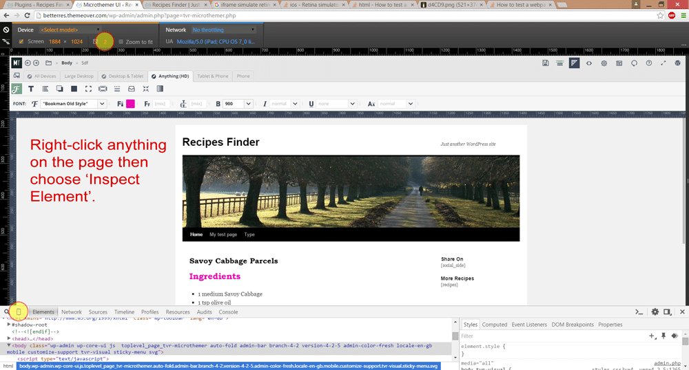
Note: you can drag and drop the media query form fields to reorder them. Simulating Retina Ready Screens (2x pixel ratio) With The Help Of Chrome’s InspectorThe computer that you use to design with Microthemer may not have the same high resolution displays that the devices you target with 2dppx media queries have (e.g. iPad Air). Fortunately, Google Chrome’s inspector can spoof (fake) the desired screen resolution so that you can see the affect of the styles you apply in Microthemer. Do the following:
Cheers, ps some useful reading on targeting high-resolution retina displays: |
|
robertlo
September 29, 2015 at 4:19 pm
|
Thanks so much. I will try that, and I checked out those links, too. Also, just on a regular computer screen, sizing the browser down, there is a place where my main menu gets pushed below the header because the top menu wraps. in those cases, I need to make the menu taller, but how do I find what screen dimensions that happens at. You can see what I mean at https://preachnet.com/freeindeed Just start with a maximized browser, then shrink it in and watch how the header responds as the screen gets smaller. So how can I find the new dimensions I need to target to fix that. Is there a browser plugin that will tell me the dimensions at any browser size I manually shrink to? |
|
Sebastian
October 2, 2015 at 2:09 pm
|
Sorry Robert, I updated my initial answer with details on using Chrome’s pixel density feature but forgot to answer your latest question. The rulers at the top of the site preview should give you a rough idea (you can drag the rulers left and right to decrease of increase the width of the screen). And if you want to know the precise pixel width of preview in Microthemer, hover your mouse over the top left corner of the rulers:
Is there some reason why you need to resize the browser window rather than use Microthemer’s rulers to change screen width? I’m not aware of any browser plugins that do what you want, but they may exist. |
|
robertlo
October 7, 2015 at 7:59 pm
|
sorry for the late reply…and wow….I didn’t know I could drag the ruler to change the browser size. That is all I needed to find what I was looking for. Also, I have put so much MT css into this header, but they have a plugin to switch header layouts for this theme, and they have a slim header layout, which is all my edits have been doing – slimming down the header. Now…if when I switch the header, the changes I made in MT to the header are still affecting the new header, is there a way to toggle off certain css edits I made to the header in MT, or would I just have to rename the rename the selectors to something that doesn’t exist in the site, like adding -off to the end of it? |
|
Sebastian
October 8, 2015 at 1:53 pm
|
You could rename the selectors so that they don’t target anything. Or, you could just delete the selectors via the main menu. If you export your header folder first you can always import it back later using the import and merge option (should you come to regret the decision). |
|
robertlo
October 8, 2015 at 2:17 pm
|
Ah. I’ll export it then. I always prefer to back up whenever possible. It just so happens that I think the slim header plugin option will work best for me. But I’ve still used MT i many other places on this site, as well as many other sites. MT is one of the best plugins ever for those of us who are meticulous aesthetically. |
|
Sebastian
October 9, 2015 at 12:49 pm
|
Great to hear that you’re enjoying it 🙂 |
