- This topic has 24 replies, 2 voices, and was last updated 6 years, 5 months ago by
 deanphillips1991.
| Author | Posts |
|---|---|
 deanphillips1991
November 30, 2019 at 1:07 pm
|
Heads up! this post was created when Microthemer was at version 6. The current version is 7. Some references to the interface may be out of date. Hey Sebastian, As you’re planning on adding a few things to improve the editors UI (sliders, dragging up and down, arrows etc) I thought I’d suggest these, for the left docked view 🙂 1) I’d love to see the padding/margin inputs reduced to similar lines (not all stacked to one column) like this (https://github.com/soflyy/oxygen-bugs-and-features/issues/647) OR brought together like this: https://drive.google.com/file/d/1d4EZZqZ086IcBNvaJ4KgDDqevfA7SQeF/view?usp=sharing 2) It would be good to be able to have a flexbox view like this: https://user-images.githubusercontent.com/56085341/68090767-fd8dc200-fe77-11e9-9a72-52a1ad01b6a5.gif I find coming from Oxygen it takes a lot longer to use flexbox 3) Icons for the pointers css (https://drive.google.com/file/d/1U1ZAAxXfPYmx8ASPCo8IxhS0uCl8OWCk/view?usp=sharing) – would save trial and error when choosing them I had a few more suggestions that I’ll update this with soon 🙂 Thanks, |
|
deanphillips1991
December 1, 2019 at 8:57 pm
|
1) Is there any way to put folders inside of folders for selection organisation at all? For example: Blog posts I’m really liking the selector folders now I’m getting used to them and this would make them even better for me. 2) I’d love to see MC handle !important tags like Yellowpencil does. It’s really intelligent at working out when the tag is needed and only adds it during that time. For the most part it’s been extremely accurate. I know during Oxygen as it sets flexbox on every div/section to start with (from what I can tell) it mean’s I’m having to manually add it often (I know about the setting to add !important to everything, but I’m prefer to not do this, when it’s not needed) Another feature to this is YCs automatical completion when you put !i it auto fills !important in the code editor. Your selection detection is leagues above there’s so hopefully this will be possible one day, although I know you’ve got so much on your plan, and don’t expect it to come anything soon. |
 Sebastian
December 2, 2019 at 12:51 pm
|
Thanks for your suggestions Dean, I will reply properly in the next day or two. I’m just prioritising some other queries as, and correct me if I’m wrong, these feature requests do not require an urgent response. Please do keep the suggestions coming though, I will respond thoughtfully to each and every one 🙂 Thanks, |
|
deanphillips1991
December 4, 2019 at 2:01 pm
|
Adding this to the suggestions too: 1. Instant targeting mode 2. Hover/active/focus states made easier + visual https://www.loom.com/share/3af27448f16c4f0ebc146e6e89ec9790 ^^ that explains them both 🙂 |
|
Sebastian
December 4, 2019 at 5:49 pm
|
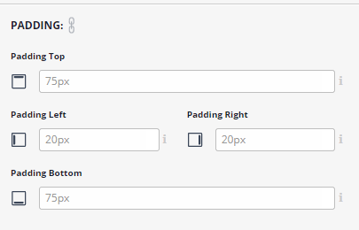
Thanks for the continuing suggestions Dean, so here are my comments on each: Docked left view 1. Padding and margin: The options do actually form a more logical structure if you widen the sidebar (using the drag option at the bottom right):
I appreciate this could happen at an earlier breakpoint. The side-docked options haven’t been super refined yet. I wanted to test if people actually like having the options on the side first. It seems they do. 2. With flexbox, do you mean icons instead of dropdown menus? Why do you see that as preferable? 3. Sure thing on the mouse pointer icons. 4. Sub-folders will be added in future. I initially resisted that request, but it’s necessary for some other MT updates, so I will implement it. 5. Regarding intelligent !important, I’m still deciding if I agree with that in principle. Another option would be to alert users to specificity issues, and suggest a different selector they can easily update to. Having !important always on seems better because it can be globally turned off. Rather than having random !important tags that users don’t intentionally create. You’ve said that you find you need !important quite a lot for overriding Oxygen, but I’m going to be looking at that specific issue over the next few weeks to see if a selector-based fix can be applied. 6. Instant targeting is something I will implement too. I’ve sketched out a plan for this already. But because it involves a change, and existing users are often a little resistant to change, I’m focusing on improvements to the properties first. As they will be less controversial I just can get them done and then allow some proper time to sort out the ideal targeting workflow. You can use the Plus [+] icon to create a selector with two clicks – one to select the element, another to create a selector. I’m still thinking about how to handle instant selectors though. I guess auto-cleanup if no styles are added is one way to prevent junk selectors building up… Thanks so much for taking such an active role Dean. Engaged users are gold dust to me! Cheers, |
|
deanphillips1991
December 11, 2019 at 9:57 pm
|
Hey mate, Been meaning to reply to this but kept getting busy with projects 🙂 1. Yeah that is a little better, however, it could still be approved, either by 2 stacked side by side or in a way similar to this http://smartbusinesstrends.com/wp-content/uploads/2017/08/ThriveArchitect-MarginPaddingEditor.jpg – this allows dragging and margin/padding to be super clear for users. It’s the same way Webflow does it too (which I assume has been tested a lot) 2. I think icons instead of dropdowns is a clearer indication as to what they do. Coming from Webflow and oxygen where we’re used to seeing it, it takes a bit of time to work them out without the visual icons for each setting. Of course, this could be adjusted on and off, however, I think icons + labels above can still take up very little space and give instant visual feedback at a glance for users who don’t remember what the options are. 4. Amazing. Been noticing how handy this would be lately. I’ve got a lot of selectors happening and I’m a bit of an organisation nut. 5. Agreed! I think that would be great. Even just a faster way to add !important in the code editor, when doing custom code would be super handy 6. I think it would be fantastic with auto-clean up. I know now I’ve created a lot of selectors, without adding anything to them, obviously there’s the lack of a blue dot, which tells me that, but 1-click clean-up buttons would be very handy. YP automatically gets rid of them if you don’t type it in, BUT they don’t actually create selectors. I had a few more suggestions, but I’ll wait till tomorrow for them aha 🙂 |
|
deanphillips1991
December 19, 2019 at 12:00 pm
|
I’d love the ability to search folders/selections also 🙂 |
|
Sebastian
December 19, 2019 at 3:56 pm
|
Hey Dean,
I think we’re agreed on the other points. And a search feature is already on the todo list. Cheers, |
|
deanphillips1991
January 16, 2020 at 12:23 pm
|
For the new multiple select, it would be great to have a way to add new selectors (IDs) to a current selector (for when we missed some that then need the same styling) |
|
Sebastian
January 16, 2020 at 3:44 pm
|
OK, I’ll have a think about how that would be achieved via the UI. Right now you can append selector manually by clicking the selector name in the top toolbar and then adjusting the Code field e.g.
Cheers, |
|
deanphillips1991
January 18, 2020 at 1:23 am
|
Yeah, I’ve been using that method for a while, but the upcoming feature working with this would be a game-changer. I often get a bit bummed out when you go to update a selector and the selector modifier doesn’t show up. |
|
deanphillips1991
January 18, 2020 at 1:31 am
|
Also, random off-topic question… How do we disable animations on different devices? I don’t see a way to disable them. |
|
Sebastian
January 18, 2020 at 10:11 am
|
Noted. You can disable animations by setting the animation-name property to none. So you can do that on the responsive tabs for mobile and tablet. You could also only set the animation via the Large Desktop tab, which uses a min-width:1200px media query, and so doesn’t affect 1199px or below. I’m assuming you haven’t customised MTs default media queries here. |
|
deanphillips1991
January 18, 2020 at 12:42 pm
|
That’s what I thought, but when I tried typing none, it didn’t do anything. I’ll try again though. |
|
deanphillips1991
January 18, 2020 at 3:29 pm
|
Tried it, and I was right. Putting none doesn’t work (either does changing it to another setting) |
|
Sebastian
January 18, 2020 at 6:49 pm
|
I wonder if there is a specificity issue happening here. Could you post a link to the page and describe which element you’re working on? |
|
deanphillips1991
January 19, 2020 at 2:11 pm
|
https://www.loom.com/share/e8205058ece74d39b1aafade4aa2a1b5 https://wordpress-250792-1004273.cloudwaysapps.com/the-framework/ ^^ hope that helps, man. |
|
Sebastian
January 20, 2020 at 11:06 am
|
Thanks Dean, I see you got this working by removing the inView event. You can actually keep the inView event if you want. But in order to override the animation set via All Devices on mobile, you would need to specify the inView event for mobile too (alongside animation-name: none). Explanation The CSS changes depending on whether or not you are triggering the animation with an event like, hover, mousever, click, inView etc. Example CSS for an animation that triggers without a specified an event (so when the page first loads): With an event (e.g. inView) Microthemer supports events by dynamically adding classes to the HTML on the page. So it adds the mt-inView class when an element scrolls into view. That makes the event-qualified CSS above take effect. But because .selector.mt-inView has a specificity score of 20, and .selector only has a specificity score of 10, event-qualified animations cannot be overridden for mobile by setting the property without also specifying the event: (this doesn’t override our event-qualified CSS added via the All Devices tab) Instead, we must do: MT will generate the above CSS if you specify the event via the mobile tab too. The advantage of this system is that you can disable e.g. inView animation on mobile, but allow click animations (and remember, MT will support multiple animations in future). An alternative approach for now is to only set the animation on a custom media query tab. You could create a new one called ‘Above tablet’ with the following media query code:
And then simply apply your animations via that tab. That way, there is no need to undo the animation for mobile. This is the principle of mobile-first design. I talk about this in the recent Gutenberg and CSS grid video. I hope that helps! Cheers, |
|
deanphillips1991
January 23, 2020 at 3:09 am
|
Hey man, I feel I might have already mentioned this, but when you work on the UI it would be great to get a position UI (maybe just in left docked if it’s too big) for positioning. I think I originally mentioned Webflows: https://www.notion.so/thesuperhumanlab/For-Seb-MT-078820de59774d31aa3dd1b2728075e2 Excited for the new UI changes that will come in the future, and excited to see what you have in mind. |
|
Sebastian
January 23, 2020 at 4:55 pm
|
Thanks Dean, I’ll refer back to this when I move on to the style option improvements. Once I’ve done the main Oxygen integration features I will move on to transform, filters and sliders/buttons for numeric value fields. But I’ll work my way through a number of existing and new properties after that. Cheers, |
|
deanphillips1991
January 26, 2020 at 12:55 am
|
Awesome! I’ll continue to add my suggestions/wishlist between then and now (hope you don’t mind). One of the things I really like about Yellowpencil (and Divi, although Divi does it badly imo, where YCs UI is a dream) is a floating window: https://www.notion.so/thesuperhumanlab/Floating-Window-3877c06d53a54c12a43380c1562f9ac9 |
|
deanphillips1991
January 26, 2020 at 9:07 pm
|
Also, any plans to allow a simpler way to add media queries (like this https://www.loom.com/share/47917ca036614cb3bda2e6c43e42152f) or is that because things can get messy that way? |
|
Sebastian
January 27, 2020 at 11:00 am
|
Hey Dean, I’m happy to add a plus (+) icon next to the pixel width text Microthemer shows to the right of the site preview (when it isn’t full width). This will reveal fields for creating an extra min or max-width media query tab in the Microthemer interface. This is actually already on the todo list 🙂 Cheers, |
|
Sebastian
January 27, 2020 at 11:01 am
|
And re the floating side bar, that should be possible too 🙂 |
|
deanphillips1991
January 27, 2020 at 12:25 pm
|
You’re the man! |